Higi
Blood Pressure Station Redesign
ROLE
Lead Designer
CAPABILITIES
Information architecture
Visual design
Ethnographic research
Usability research
Challenge
Incomplete station visits and low engagement
Although you might not be familiar with the company's name, you’ve likely encountered one of their blood pressure stations. With over 10,000 locations across the United States and Canada, higi blood pressure stations are the most commonly used channel for users to monitor their health numbers (and leverage that reference also through web and app).
However, as the company sought additional partnerships and advertisements, the user experience at these stations became distracting and cumbersome.
Only 27% of our blood pressure-only users complete the experience and reach the final results screen. Many leave before viewing their blood pressure results, limiting our ability to inform them about actions they can take to improve their overall health.
It was clear that a re-evaluation of the station experience and overall architecture was necessary.
Objective
What we set out to achieve
To decrease the unintended drop off rate at the station experience by re-engineering the flow.
Increase completion rates for tests offered on the stations.
Entice and encourage authentication of station visitors, increase those authenticated visits.
Determine and set up metrics to track the completion rate and the visitor engagement by the number of tests taken at a station visit.
Approach
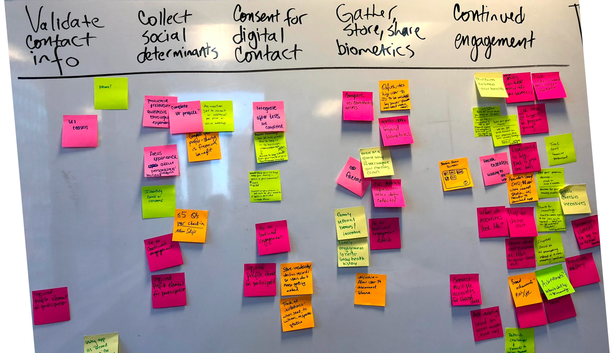
Addressing the issue of experience debt
When I joined the higi team, I became involved in developing product features, enhancements, and auditing our marketing campaigns. As we expanded partnerships with grocery stores and health providers, we noticed a misalignment in the user experience that temporary fixes couldn't address. And that was coming through in the station visit analytics.
To effectively scale our business and improve the blood pressure station's flow, I mapped out the entire user journey, including tests and advertisement placements. This allowed me to conduct a thorough audit and identify gaps and opportunities within the user experience.
The original station experience was quite limited and restrictive. Additional content, partner enrollments, and promotions disrupted the flow, distracting patients who simply wanted to view their test results. The existing technological and design issues contributed to further inconsistencies, including fragmented terminology and visual design. We needed to address these challenges, along with the distracting advertisements that diverted patients from their primary goals.
Another unintended consequence of the linear flow was that it forced visitors to make all their test decisions upfront, without the ability to navigate back or re-engage with the test selection in a single visit.
Advocating to move away from a linear station flow
Recognizing the linear nature of the current experience, I proposed the hypothesis that a non-linear station experience could address several of these issues, reducing user friction while providing the business with the necessary engagement. With this hypothesis as our foundation, members of the product team began to research competitors who offered non-linear experiences to enhance visitor engagement.
With this hypothesis as our foundation, members of the product team began analyzing competitors that offered non-linear experiences to boost visitor engagement. This approach would provide benefits for both the business and visitors in the following ways:
The modular design would allow for easy scaling as the business introduces more health tests and information at the station.
Users would be able to view all their test options upfront and easily navigate back to the homepage to select and complete additional tests.
Validating and gathering feedback
By using wireframes and initial visual concepts, we designed and programmed a QA kiosk station featuring our proposed homescreen and a non-linear flow.
Through moderated, scenario-based testing sessions, we observed that visitors could easily select a test, complete it, and understand how to "Exit" or end their experience at the station with our homescreen design.
Our team aimed to gut-check if we could improve the existing behavior of station visitors unknowingly ending their visits. Additionally, We saw participants take notice and engage with the additional tests and health information displayed on the home screen.
Presenting and selling the ‘why’ and ‘how’ for the business
The next step was to secure buy-in and support from the business stakeholders. Together with the product manager, we created a presentation that outlined our conceptual flow and testing results to present to the stakeholders.
Additionally, I developed a plan for how to implement the design improvements alongside the immediate tasks at hand. The product manager and I also initiated the re-engineering of the station Homescreen as our team's first strategic bet.
Solution and outcome
Delivery and launch of the station architecture
To prepare for development, my visual counterpart and I finalized wireframes, interaction notes, and visual designs while introducing a content matrix. We created various user states using a new modular approach and I provided design support for the updated visuals.
Recognizing the need for additional collaboration on the homescreen modules, we validated the architecture and scalability of each test module. We also involved insights and product teams in prioritizing the information sequence for these modules. To confirm the effectiveness of this sequence, our team conducted usability testing with existing higi station users.
The development team was encouraged to participate throughout the entire process leading up to the handoff. Additionally, our team urged them to keep us involved for design quality assurance (QA).
This approach was then implemented at higi stations nationwide.